Categories
Uncategorized

Nothing Left But Hope

The world continues to take the pandemic increasingly seriously. We will spend many years discussing what we should have done, how many lives we could have saved if we had moved faster, responded quicker, or been more aggressive; but the world at large now accepts action as the only choice left to save lives. We now enter the hardest portion of the response: blind faith that the measures we enact today will pay dividends in the future. And a desperate search without sufficient data to guide us, for the best way to save as many lives as possible.

Where We Are

In the last post we discussed the epidemic curve we were on and how we would hope to see the projections lower if the measures countries were putting into place were successful.

Those projections were:

Projections from the previous blog post Our Curves, Ourselves

After I wrote the post last week, the model I used to generate these estimates jumped up by a small amount, taking it slightly past the upper projection and which then settled there. In the past seven days, the April 1st estimate has stayed within a tight 500 death range. The model now predicts that on April 1st, Situation Report 72 will list global fatalities as being between 42,500 and 43,200.

New Projections

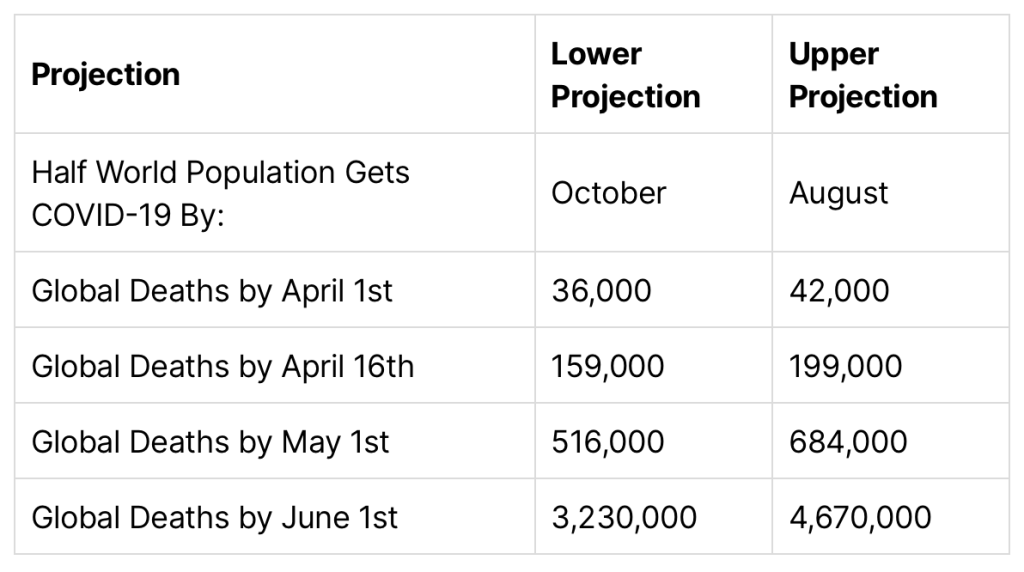
Here’s the full new table:

No Change In Condition ProjectionConservativeAggressive
Half of World Gets COVID-19 By:OctoberJuly
Global Deaths by April 1st42,50043,200
… by April 16th172,000208,000
… by May 1st588,000727,000
… by June 1st4,530,0005,100,000

Again, these are the projections of the curve we’re on. This assumes that our actions have no impact. Everything we know about COVID-19 tells us they will have an impact, and our behavior has a chance to take us off this curve and put us on a flatter one. While the last round of projections appear like they’re going to be accurate, they were only made a week ago. It will take several weeks for a new curve to show up in the fatality data that this model is based on. Hopefully we will see the April 15th data closer to, if not under, the more conservative estimate.

What if it Gets Worse?

If you don’t want to read a data driven argument on why these numbers might very well get worse even with everything we’re attempting to do, please skip to the next section.

It’s okay. Reading this or not won’t change the outcome. Skip ahead and see why these projections don’t really matter anyway and that we’re still doing a lot right.

For everyone else, let’s start talking about the model we’re using. The model that generated the projections above is extremely naive. It essentially assumes that all of today’s conditions will remain the same and follows the exponential curve the fatality rates we’ve reported so far best fits to and extrapolates blindly. It is the stupidest model you can write and call it a projection.

Epidemiologists would rightly point out that this model is ridiculous since there are so many other factors in play. I agree with that sentiment entirely, but would respectfully suggest that we may be closer to having no clue on the correct numbers for those factors than we are to knowing the right values for them. From the other models I’ve seen from epidemiologists trying to study this so far (It’s been heartening to see folks finally releasing these! I have long been frustrated that I couldn’t find better data here and real projections! It’s why I started this blog!) are essentially making educated guesses based on some previous datasets and basically picking the constants that sound right to them. Which is a totally valid thing to do in the middle of a pandemic, and something epidemiologists have trained their entire careers to do. Picking constants is their prerogative and they are absolutely trained to do it better than anyone else.

But I’m going to keep blogging about what this stupid model says because I think there’s some merit in a completely stupid model. You see, with a stupid model, you expect it to be dumb. In a world of uncertainty the one reliable thing may be that these models are always dumb. They will never see changing conditions coming. So if they are stable, you can be certain conditions reflected by the data aren’t changing yet. And if they are unstable, you can be certain conditions are changing. No one would ever use this model to predict the outcome of an intervention, because it isn’t smart enough. And that’s fine, because if you want to predict human or biological behavior, you absolutely should ask an epidemiologist. They most likely won’t really know either, but they’re the most qualified people in the world to guess about it. And you should listen to their guesses, because they’re the best we have.

So. Back to our dumb model.

The projections above are all based on no change in conditions. There’s two different types of conditions that we expect are likely to change in the coming days, and they can each push the model in dramatically different directions:

The first is human behavior. We’ve covered this one most extensively and it’s where the most good news is to be found. Humans all over the world are doing so much, in so many ways to stop the spread of COVID-19. If you can stop having anxiety about this whole thing long enough to appreciate it, it is a rather inspiring moment of solidarity. One that is finally resonating worldwide.

The second is medical system capacity. Not to repeat myself too much but—this model is dumb. It doesn’t know anything about hospitals, ICU beds, staffing levels, or healthcare breaking points. These things are likely to provide an accelerated fatality rate when they start happening.

Italy is probably the country currently furthest along in this particular struggle. Here’s their current outcomes so far:

Current case outcome for Italy

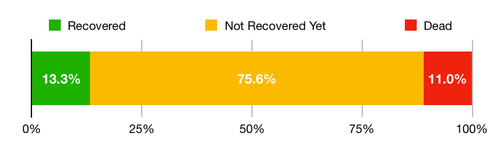
This is a hard graph. While we can arguably expect most of the 75% of the people who haven’t recovered yet to make a full recovery (95% of pending cases are currently classified as mild, though some of them will likely become severe later) an 11% fatality rate of all confirmed cases is a hard datapoint. There’s a few possible reasons we’re seeing such a high fatality rate here:

  • There’s an order of magnitude more cases here that just haven’t been confirmed or had or will have successful outcomes without ever interacting with the medical system.
  • Hospital resource prioritization means we’re only seeing the data for the most serious cases.
  • The outcomes in Italy really are worse than elsewhere due to an overloaded medical system and we can expect to see elevated fatality rates in areas where healthcare systems become impacted.

The real story is likely a mix of these factors. But it’s the last bullet point that is the major reason we could have a lot more fatalities than the model currently predicts. Given what we know about the state of the Italian healthcare system, it is likely that while some of the other possibilities are likely playing a role in this data, healthcare system overload is likely showing up in the data as well.

To be very clear, this is not to say the Italian healthcare system is bad. They’re just handling more than almost any system could reasonably be expected to handle. Unfortunately the Italian healthcare system is comparatively good on a global scale, which means some countries with worse healthcare systems are likely to see even worse outcomes than we’re seeing in Italy.

What if We Don’t Succeed?

I think the most scary thing right now is the idea that we won’t bend the curve. That we won’t be able to stop this pandemic. Among everyone I know, these seems to be the thoughts that weigh heaviest right now. And there’s elements of truth to them. Ultimately only a vaccine or treatment protocol seems likely to stop the pandemic entirely.

But our actions today are still critical. Everything we are doing, everything any group of people on this planet tries to slow the spread, is worth lives. Whether it’s washing your hands, wearing a mask, social distancing, or locking down entire cities. It’s all important. And it will help save lives. Either by slowing the spread down to give our hospital systems a little more time, or by slowing the spread down to give us time to develop treatments or a vaccine. Every action we take to slow the spread helps.

It ultimately doesn’t matter whether we go above or below these projections. What matters is that when it comes down to decisions that allow us to slow the spread of COVID-19, we chose to act. And ultimately that’s the only thing we can do. And that’s the track and outcome that saves as many lives as possible. Each of us can make that decision for ourselves, and help as many people around us as we can.

As long as we do all we can, we can’t fail.

Categories
Uncategorized

Our Curves, Ourselves

Hi all.

In early February this blog tracked, day by day, the spread of the situation in China and whether containment measures were working to confine the largest spike in that country to Hubei Province, and whether containment measures were working to confine the majority of cases to China. Initially, this later effort looked successful, and the Chinese response seemed to be working. By February 24th, the data seemed clear that while the effort inside China had been a remarkable and unprecedented success, the situation outside China was not contained and a pandemic was inevitable. I wrote:

Hence, COVID-19 seems likely to become a pandemic.

I expect that most people will begin referring to it as one within the next two weeks.

Pandemic – 24 February – Rank Amateur Epidemiology Hour

On March 11th, the World Health Organization officially declared the situation a pandemic. A careful reader will notice this was two weeks and two days later, so I guess I did miss my guess.

The entire globe has started discussing the pandemic and in many cases have started taking action to prevent it. It’s widely recognized that what we’re facing is a once-in-a-century pandemic. Now that we’re all on the same page, there hasn’t been much reason to post here. There’s better sources of data and all kinds of interesting analysis to read elsewhere, if that’s something you’re looking to find.

So why this post?

Well. There are still a few projections that are clear to anyone running statistics on the current data, but aren’t heavily discussed yet. The first is the fatality projections. A few studies have alluded to them, but there’s not many people who are outright publishing projections. The second is that the current data is showing that what happened in Wuhan was much more gentle than the exponential curve that we’re facing globally now. Epidemiologists clearly have done the math on both these, but it’s not always obvious from their reports. I think mostly because as a group, epidemiologists tend to be a bit conservative about extrapolating into the future. Their field places a large weight on not scaring the public and maintaining public trust, which can sometimes conflict with being forthcoming about a scary trajectory. Another major reason this isn’t being as widely discussed is because our public health policies are actively designed to make sure that none of these projections ever become true. The work of almost every epidemiologist engaged in this effort is designed to avoid the future the statistical projections show. And the history of epidemiology shows they typically succeed.

Since I’m not an epidemiologist, I’m just going to talk about what my model says about the curve we’re on. And why I hope it’s wrong:

The Past

Two to three weeks ago, the question I was frustratedly asking people who were convinced that this would not be that bad was: “Why do you think what happened in Wuhan won’t happen here?”

It’s become apparent that I was too much of an optimist.

Here’s the graph from the posts in February when the updates on this blog tracking the rate of acceleration of the reporting cases of COVID-19 in various subgroups each day. This was when the rate of acceleration for the confirmed case data in Hubei Province was just starting to turn around:

Back in February, this was the rate of exponential growth in Hubei Province and other subgroups.

This was the peak of the acceleration of the outbreak in Hubei—and so far in China. Things looked good here. And in what turned out to be excellent news, the situation in Hubei Province and the Rest of China really did improve afterwards. Unfortunately due to significant under-reporting of COVID-19 cases outside China, the Rest of World data was not as good as it looked and things changed sharply later that month. Containment in China had failed and a global pandemic was inevitable.

The Present

It has unfortunately slowly only gotten worse and worse. Here’s what the Rest of World graph looks like now:

So while the Hubei Province confirmed case projection peaked at an exponential co-efficient of 2.18, the exponential co-efficient we’re seeing in the confirmed case counts in the Rest of World data rose to 8.08 in the latest Situation Report from the World Health Organization. This means the exponential curve we’re on globally is much worse than the curve Hubei was on.

So it turns out “Why do you think what happened in Wuhan won’t happen here?” was the wrong question. Wuhan is the optimistic scenario. One Italy is now well past. We will need to do a lot to strive to get down closer to Wuhan’s lower, flatter curve.

The graph above also includes what we’re seeing in the fatality data. There are many who suggest that the current spike in confirmed case count is the rest of the world finally making up for lost time in under-reported testing. Unfortunately the exponential rate of the fatality trajectory is also much higher than Wuhan ever reached. It seems unlikely we weren’t noticing people dying before and are only counting them now. So it’s not just under-reported testing. This trajectory appears to be quite stable, providing increased evidence that there’s a much more rapid acceleration globally than we ever saw in Hubei Province, or in China.

Luckily, the data we’re seeing now doesn’t necessarily reflect our future, but rather our behavior from the past. This is what happened because we in the rest of the world didn’t respond quickly enough and take the pandemic seriously. It is, we fervently hope, not the outcome that will occur now that we’re beginning to do so.

The Future We Hope To Avoid

So given what we’ve been seeing, we have changed our behavior. Many countries and regions in the world are in some form of lockdown, shelter in place, or similar health order. I’m writing this blog post under one. Perhaps we should have done it sooner, but at this point, it’s just a relief to see it being done.

The world is responding. Social Distancing has entered the common vernacular. We are “staying home to save lives”. We are washing our hands. We are not shaking other people’s hands. We are staying 2 meters or 6 feet apart. We are making face masks on sewing machines. We’re doing everything we can to flatten the curve. We’re coining new slogans and graphs and posts daily and each one helps us all understand more and more about why we’re doing this all, and why it’s necessary.

Here’s another take on it:

This is what my model says our future would look like if we hadn’t begun to change our behavior. This is the trajectory we were on:

ProjectionLower ProjectionUpper Projection
Half World Population Gets COVID-19 By:OctoberAugust
Global Deaths by April 1st36,00042,000
Global Deaths by April 16th159,000199,000
Global Deaths by May 1st516,000684,000
Global Deaths by June 1st3,230,0004,670,000

If this isn’t the future you want: changing our behavior is required.

If we’re successful, we’ll change this trajectory for the better and see the curve flatten. Our future will be better than the optimistic case in the projections above.

And yes, until we have a vaccine or treatment protocol and the appropriate level of distribution of those interventions, we’ll need to keep doing this for awhile. (Each region will make their own decisions on when to phase movement restrictions on and off, but collectively we’ll all want to be washing our hands a lot better and more than we used to for awhile.)

It’s also possible that we do these interventions and don’t see a significant change in the curve. There’s a lot of countries that haven’t changed their behavior yet. And a lot of countries which haven’t even begun the process of finding the cases they have.

The projections above are why the world must do everything we can to avoid the current trajectory.

Categories
Uncategorized

Pandemic

Well. The last time we talked I said the data wasn’t conclusive on what was going on. And that we should wait a couple weeks for more data. Since then, the World Health Organization has released 14 more Situation Reports. They also got around to naming the disease, so 2019-nCoV is now COVID-19. Now that we’re here, in the future, some things are more clear, some are still hard to decide on.

Healthcare Data Reliability

Two weeks ago, the data on Hubei Province wasn’t conclusive on whether or not a real slowdown was occurring or whether the healthcare system was so overwhelmed at that point in the outbreak that it was unable to confirm all existing cases. Less than a week later, we got a resounding answer that this was exactly what was happening. China, along with the WHO switched to including “clinically diagnosed” cases along with lab confirmed cases for this Province and included a backlog of over 15,000 cases that they assessed clinically as COVID-19, but had not had the capacity to confirm by PCR in a laboratory.

So, the outbreak outstripped the ability of the local healthcare system to test for it. This is an unsurprising outcome. It’s actually quite impressive that amidst a crisis that was admitting thousands of new cases per day, the Chinese healthcare system was laboratory confirming most of those thousands of them for so long. As a point of comparison, the United States, despite warning and few active cases in its borders, appears to have a testing capacity of about tens of samples per day—nationwide. The CDC in this country requires centralized testing for final confirmation and has rolled out their own version of the test to labs which is required for confirmation. It is, as of yet, not going well:

Only three of the more than 100 public health labs across the country have verified the CDC test for use, according to the Association of Public Health Laboratories.

https://www.politico.com/news/2020/02/20/cdc-coronavirus-116529

Other governments are different spots on the spectrum and the results here appear to be highly variable. More on this below.

China

Despite what we just covered, there’s no solid conclusion on the state of the situation in China. While the healthcare system is definitely overwhelmed in some places, the data that does exist in Hubei even shows signs of improvement. The same is happening outside Hubei. Here’s what things look in China outside of Hubei Province according to the official data:

This is miraculous.

If true.

It is admittedly hard to believe that the new cases could go down across the entire country so evenly quite like so. These numbers are reflected similarly at the province by province level. One conclusion is that the rather strict and heavy handed quarantine measures employed by the government and generally followed by the communities involved have been effective. Another conclusion is that some parts of the country may have simply stopped detecting new cases, for one reason or another.

This is still an area where we’ll need to give things time. In an overwhelmed healthcare system the new case counts would top out at the level the healthcare system could detect them and stay there, but in this case the data shows them outright dropping. This points towards the possibility of a real improvement. It’s hard to know what data is right or how the reporting is working on the ground. Our other source of data, the fatality data has not yet shown the same level of deceleration. But it’s also unclear whether we’d expect it to at this point.

Outside China

Outside China the situation is clear. Things are getting worse. So much so that this latest round of datapoints outright broke my model. COVID-19 is no longer an outbreak focused on one country. This is clearly moving towards a global pandemic.

Here’s what happened in the last few days outside China in the rest of the world:

The graph above is without the weird cruise ship that was reporting tons of cases sporadically. Hence the “Rest of World (adj)” notation. If you don’t like excluding the cruise ship from these numbers, we can add it back and you’ll still see this unfortunate exponential curve forming:

These are primarily driven by local transmission from outbreaks in South Korea, Japan and Italy. There’s also a minor new-ish outbreak in Iran. Singapore has case numbers in a similar range, but the outbreak here has been happening for longer and this country has been exhaustively working to find, trace, and quarantine those who have COVID-19.

If that was the end of the story, we could potentially look past three separate countries across multiple continents reporting new major outbreaks in the span of three days. We could pull ourselves together and perhaps see a way to decide this isn’t necessarily going to end in a pandemic. We could get there.

But during an outbreak and global public health crisis, we have to read between the lines in the data. These countries are reporting spikes. These countries are also the countries that are broadly testing for COVID-19.

In my last post, I was worried about discovering outbreaks in countries that struggle with healthcare relative to other countries. I was concerned that we wouldn’t discover things until after the fact, because by the time we noticed the outbreak it would be fairly widespread. This concern seems accurate. Unfortunately it also seems optimistic.

We’re finding similar situations in countries with top-tier healthcare systems. These are likely the ones we are finding earlier than we will later find in other countries. Given this, it seems unlikely that we contain widespread COVID-19 outbreaks to any specific country, or even specific sets of countries.

Hence, COVID-19 seems likely to become a pandemic.

I expect that most people will begin referring to it as one within the next two weeks.

Don’t Panic

It won’t help.

If you do decide you need to purchase something or stock up, please do so in limited quantities. It’s absolutely appropriate to send the market signals that there might be a need for more non-perishable food and other goods in the future. But if everyone goes out to try and buy a ton, we’ll run out due to sheer panic alone rather than real lack of supply. Be gentle with yourselves, each other, and your supply chains. There are many humans and this will go better if we do not all panic at once.

If you must, take turns.

Also: if what China is doing is actually working, we may all want to consider doing some of what they’ve done to fight this disease.

Categories
Uncategorized

Stats Update – 8 Feb 2020

The situation appears to be stabilizing and getting less severe across the entire world:

The co-efficients of the exponential term of the best fit exponential curve. (The rate of the rate of change.) The graph is striking different today than yesterday due to a change in how I’m calculating the Rest of World population, discussed more below.

I think we’ve also likely reached the point where it no longer makes sense to go over these models daily. I’m also not going to list the specific predictions from the fatality model today, (it is still going up and probably will for awhile) since the best available data shows that it is still working off an exponential curve that is likely weeks out of date from the current situation and will not accurately predict much about the future. It should be ignored until we have signal on its accuracy.

Hubei Province

The new confirmed cases from each situation report. These report the new cases confirmed in each 24-hour period.

Hubei Province appears to be stabilizing at a linear growth rate. The same three possibilities from yesterday apply:

  1. Hubei Province is stabilizing and no longer accelerating.
  2. This is a temporary change. (Less likely than yesterday!)
  3. The healthcare system for the province is too overwhelmed to accurately confirm new cases as the outbreak scales in size.

It seems, for the moment, safer than yesterday to assume the second situation is probably not what’s happening. New case counts are in the same very rough range for Situation Reports 15-19. This doesn’t appear to be a temporary artifact.

So now we need to figure out whether it’s the first or third situation. This is going to be harder. There’s two ways we’ll be able to figure this out from the data we have:

  1. We start to see new case counts drop consistently. This would support a break in the outbreak.
  2. The fatality model a week or two from now hasn’t shown any sign of slowing. The data would then support an idea that we’re not getting accurate confirmed case counts due to an overloaded healthcare system.

On the ground information from Hubei is the other key way we will be able to tell these apart. So that’s something to keep an eye out for in the coming days. In either case, it seems days or weeks before we’ll know much here. The best working assumption until then is probably to assume the outbreak is indeed stabilizing.

Rest of China

The model continues to show an effective response in the rest of China. That’s it. That’s the post.

Thank a Chinese healthcare professional today!

Rest of World

The past few days this has not seemed like good news. Yesterday’s model looked like this:

The population we’re talking about in this section is the red line. It definitely doesn’t seem to be going in the right direction, it’s sharply heading up. I was pretty critical about some of the response in this section in the past few days. But yesterday there was a caveat:

This looks real bad. But luckily it isn’t as bad as it looks. The majority of the spike here is from the confirmed case counts from one cruise ship as 41 new cases were confirmed there today. The fact that it happened to be included in the reporting on this day is not really significant. And the situation on the cruise ship seems unique enough to not necessarily say much about how we’re handling the spread of 2019-nCoV elsewhere. After this batch of cases are added to the count, over 20% of all the global cases outside China are on this one cruise ship.

From yesterday’s post

I also noted:

Perhaps in future days we will remove the cruise ship from counting as part of this population

Yesterday’s post

So. I did that today. The cruise ship is only split out in the last three reports, (prior to that it was reported as part of Japan’s cases, since it is in a Japanese port) but looking at the new case number for the split-out group in Situation Report 17, you can split out the group from the case numbers in Situation Report 16 as well. And this is what you get:

This data shows that excluding the cruise ship, the curve is falling back into the linear domain and is not well predicted by an exponential growth model. Excluding a cruise ship seems like a weird way to go, but given the number of cases on the cruise ship in comparison to the international cases otherwise and the relatively unique situation of a cruise ship, it doesn’t seem right to evaluate the global response of 2019-nCoV based on that data being included either.

It now appears to be much more reasonable to come to the conclusion that the situation outside of China has an effective response and is becoming stable.

Other than the cruise ship, there is one remaining concern, which is some cases in countries without good healthcare systems may be unreported at this time. And may continue to be unreported for awhile until we finally discover a whole cluster. This doesn’t seem like a tremendously likely outcome, but is one thing worth keeping in mind before we completely assume the containment measures have been effective to isolate the 2019-nCoV outbreak to mostly inside of China.

Categories
Uncategorized

Stats Update – 7 Feb 2020

Today we’re no longer seeing the same day by day trends we saw over most of the past week and are starting to see potential that the models are stabilizing:

On left: y-axis scaled absolute confirmed case data for each population overlaid.
On right: change in the best fit non-linear regression curve exponential co-efficient. (Or: change in the rate of change.)
In both cases: up is worse, down is better.

Things stopped continuing in a consistent direction in every model today, which is, in my mind actually good news since most of them were getting worse. When the models move in small directions, but do so consistently, it worth tracking as a potentially a concrete steady change in the situation. When models move around by small amounts inconsistently, it’s more safe to discount the movement as noise. We’ll hope to see things move up and down at about the same rate if the model is stable, or start to fall consistently if indeed the situation is decelerating.

Hubei Province

Today’s situation report shows the first good news in awhile for Hubei Province. Today’s model shows a deceleration of the exponential growth rate compared to the yesterday’s rather than continuing to show further acceleration day by day. Unfortunately this could mean one of three things, the last possibility being least good:

  1. The change in growth rate is stabilizing or slowing.
  2. This is a blip and we’ll see continued uptick tomorrow.
  3. Hubei Province’s healthcare system is overwhelmed and unable to confirm all the cases that are coming in.

While the second situation will show itself true or not in the next few days, it’s going to be hard to disambiguate between the last and first situations if it’s one of those. One way to try and figure it out is a bit of a desperate assumption we can make: which is that it’s easier to count fatalities than confirm live cases. If we see no slowing of the growth rate of the best fit exponential curve in the death rate, but a slowing of the exponential curve in the confirmed case rate, the last situation may be more likely than the first.

Frustratingly this isn’t really a great approach either, since the count of fatalities counts the rate of acceleration at the end of 2019-nCoV cases while the confirmed case count tracks the rate of acceleration nearer to the beginning of the cases. Which means if things really are settling down to a stable curve (or… perhaps even decelerating) we would not expect the fatality count to show this trend for a number of days yet.

The best approach may be to mix some knowledge of on the ground anecdotes to understand whether the health system feels more overwhelmed than in previous days and whether case count confirmation is seeing a significantly higher backlog to understand whether the last situation might need real consideration. Unfortunately there’s no great way for me to get data on this that I’ve found. And there’s no mention of what the on the ground situation is looking like in the WHO situation reports.

Rest of World

China outside Hubei Province continues to show a slight decrease in the best fit exponential curve. This continues to be consistent with a hope that the response in China outside Hubei Province is working. A friend of a friend reports that two other provinces went under quarantine restrictions recently. News reports several more. It appears China is continuing to curtail travel between provinces. There’s not much to do here other than note this is one of the few populations showing sign of an effective response to the outbreak and wait and see if it continues.

Now let’s talk about the Rest of World outside China:

This looks real bad. But luckily it isn’t as bad as it looks. The majority of the spike here is from the confirmed case counts from one cruise ship as 41 new cases were confirmed there today. The fact that it happened to be included in the reporting on this day is not really significant. And the situation on the cruise ship seems unique enough to not necessarily say much about how we’re handling the spread of 2019-nCoV elsewhere. After this batch of cases are added to the count, over 20% of all the global cases outside China are on this one cruise ship.

So, let’s not generalize too much from this data and its change. That said, if you do eliminate today’s influx from the cruise ship you still see an increase in the model about in line with the changes in the past days, so the cases outside China do still appear to be accelerating. Perhaps in future days we will remove the cruise ship from counting as part of this population and leave it just in the totals. (Forking a whole separate population to monitor one ship seems overmuch?)

Key Numbers

I did this table yesterday, I think I’ll keep updating it for a bit:

NumberTodayYesterdayLast Week
Hubei – Half Pop (Months)141336
Hubei – Exp Co-Eff2.122.181.71
Rest of China – Exp Co-Eff1.291.331.63
Rest of World – Exp Co-Eff1.471.191.61
6 month fatality prediction61,61960,67742,521
Half Pop -> The amount of time the model predicts it would take for 2019-nCoV to spread to half the population
Exp Co-Eff -> The co-efficient of the exponential term of the best fitting curve. (The rate of the rate of change in the models.)
6 month fatality prediction: again, it is important to state that this assumes no treatment intercept
Categories
Uncategorized

Stats Update – 6 Feb 2020

Yesterday’s trends continue in today’s data:

  • The situation in Hubei Province continues to accelerate.
  • The situation in China outside Hubei Province shows signs of an effective response as the exponential growth rate in this population continues to slow.
  • The situation in the Rest of the World shows signs of an ineffective response as the exponential growth rate in this population continues to rise.

Key Stats

Changes in the exponential co-efficient in the non-linear model for various populations of the 2019-nCoV outbreak.

I’m going to do something new today, which I haven’t done before. I’m going to report the estimates of my fatality model. I think since I keep reading folks on the Internet compare this to SARS, MERS and the flu and try and rationalize this as being small potatoes in comparison, it’s time to talk fatality numbers.

Let’s start comparison wise quickly: For the former two, SARS and MERS the outbreaks were never this widespread. For the flu, I think it needs to just be stated that the flu is rather bad. That it already happens to kill a lot of people each year isn’t a great comfort, nor something to inspire apathy. The outbreak of new flu strains is something that the WHO has spent considerable time and effort preparing against.

I think people tend to underestimate the flu, often because most people who think of having the flu, or someone else having the flu, don’t actually think of a case of an actual influenza infection. People use the word “flu” to describe a set of symptoms, many cases of which aren’t actually caused by a real case of influenza, but rather some milder sickness with similar symptoms.

Today’s table lists the number of people the current model predicts may die of 2019-nCoV before August if we do not have a treatment or vaccine intercept before that time:

StatCurrentYesterdayChange
Hubei – Exp Co-Efficient2.182.13+.05
Hubei – Half Pop Spread Estimate13 Months14 Months-1 Month
Rest of China – Exp Co-Efficient1.331.37-.04
Rest of World – Exp Co-Efficient1.191.13+.06
6 month fatality estimate (if no improvement in treatment protocol)60,67757,509+3,168
Key statistics table from the model outputs for data in Situation Report 17. The exp co-efficient numbers track the rate of change in the exponential curve modeling. The “Half Pop Spread Estimate” tracks how long the model thinks it will take 2019-nCoV to spread through half the population of the Province of Hubei if the current rate continues. And finally the last row is the six month fatality estimate.

Development of a vaccine or treatment protocol changes everything here. Health professionals and scientists are hard at work on developing both. There will definitely be a successful intercept between the growth rate of 2019-nCoV and medical intervention, the big question is how long it takes to produce enough medicine, effectively distribute it, and the number of cases and fatalities that occur in the meantime.

Hubei Province

The situation in Hubei Province remains severe as the response efforts fight to slow the rate of growth of the rate of growth. (Yes, I meant all those words.) We’re seeing some signs of discontent in the area. A notable doctor died today in Wuhan who was one of the scientists who discovered 2019-nCoV early in the outbreak. He was an early reporter of the outbreak, was ignored / punished by the authorities, and then after catching 2019-nCoV scientifically, caught it personally. His death has triggered widespread outrage, and harsh criticism that is unusual for the area. Unrest at this point given the strict widespread quarantine measures in place isn’t a surprising outcome, but doesn’t seem likely to make response efforts easier.

While the criticism that the government should have taken the outbreak more seriously earlier may have merit. And criticism about punishing a doctor for speaking up certainly does (the doctor allowing the world to respond to the outbreak earlier), when it comes to current on the ground policy changes it’s hard to think of any good additional more aggressive measures they could take at this point. Which unfortunately seems to leave both the frustrated residents and the government in a bad place to resolve or change much here.

With some local sentiment shifting, widespread sentiment internationally is also catching some increased criticism of the Chinese government. People continue to question the accuracy of the data being released. We talked about this a few days ago. As a brief update, my data continues to show no divergence in the models for reported deaths and confirmed case counts. Which means that if there’s underreporting of the data going on, it’s remarkably consistent underreporting. Perhaps it is easier to believe that the data really is consistent than it is to believe that thousands and thousands of cases are being hidden.

But I’m just a rank amateur here. At least several public health professionals seem to outright assume underreporting is occurring. Along with a lot of people who simply don’t trust the Chinese government and point to places in the past where that distrust was justified. I don’t know that there’s tons of basis for these claims, but my models are only as good as the data I provide them, so it’s important to point out that others may make different assumptions about the reliability of this data.

Rest of China & Rest of World

This category continues to be a surprise to me. While China has a massive logistics problem on their hands, they are successfully lowering the spread rate in the population outside Hubei Province. And unfortunately, at least according to this latest data, the same may not be true of the countries outside China. While the exponential curve that best fits the data is still steeper in China (even outside Hubei), the trend of those changes is moving slowly but steadily to intercept and become shallower than in the countries outside China. This would be a serious shame, because in absolute numbers there’s just so many fewer cases in the Rest of World population and an effective response seems, in some ways, like it should be a more tractable problem outside the main outbreak areas.

Ultimately it will be unsurprising if this does occur. Coordination problems are significantly harder with 23 countries than they are with one and even with fewer cases, that may cause enough problems to prevent an effective response. Perhaps in the fullness of time we should consider this an indictment of the way our political systems are too often structurally deficient at solving global problems.

Categories
Uncategorized

Stats Update – 5 Feb 2020

Some highlights today:

  • The situation in Hubei province continues to accelerate.
  • Chinese measures to contain and respond to the outbreak continue to slow down the exponential growth rate of 2019-nCoV in the country outside Hubei Province.
  • The Rest of the World continues to experience a relatively much slower growth rate of 2019-nCoV. More cases are now from local transmission or other countries than are imported from China.

China

The situation in Hubei continues to accelerate. Yesterday I discussed how my models make predictions for when half the population would be infected and that time is down to 18 months for Hubei’s population. With today’s additional datapoint the new curve that fits best yields a prediction of 14 months. The exponential rate continues to advance upward, with the exponential co-efficient of the best fitting curve having advanced again today from 1.99 yesterday to 2.13 today.

It is difficult to understand what an effective response looks like at this point in the outbreak with this model. Tomorrow, the amazingly built-in-only-ten days Leishenshan Hospital opens 1,500 new hospital beds. The statistical model predicts that in the 24 hours following the opening, at least two new cases of 2019-nCoV will be confirmed for each of the new beds. Currently only about 13% of confirmed cases are classified as “severe” but the stage of the response is definitely one in which even confirmed cases of 2019-nCoV will need triage to pick and chose which ones are severe enough to get hospital beds in the facilities designed to contain the outbreak—and which are not. The remainder of the cases will have to go to quarantine elsewhere. And the very next day there will be even more new confirmed cases, without the benefit of a new hospital.

These graphs show the trend in the exponential curve which best fits the data. The axis between them are different so don’t pay attention to where the lines are, but you can see the difference in the trends. While things in Hubei Province are getting worse, the Rest of China is slowing down the exponential growth rate.

Somehow, despite the severity of the situation in Hubei Province, the situation in the Rest of China manages to remain surprisingly different. A slowing of the exponential growth rate in this population continued for a fifth day. That the exponential growth rate can be slowing elsewhere while the situation in Hubei continues to accelerate is a credit to the millions of people of China who are following public health protocols and maintaining containment measures, along with the amazing public health officials working on this problem in those countries.

Elsewhere

Outside China we continue to see a case growth rate that is closer to linear than exponential. The sharp limitations on travel appear to have resulted in only a small number of new cases resulting in travel from China to other countries. Unfortunately local human-to-human transmission continues to spread 2019-nCoV elsewhere. The WHO broke down the numbers of new cases by travel history ain this report and the data is illuminating. Out of the cases discovered in the last 24 hours outside China with known travel histories:

  • 10 travelled to China and are presumed to have caught 2019-nCoV there.
  • 21 have no history of travel to China, and caught it from local human-to-human transmission, or from human-to-human transmission in another country outside of China.

The good news is the exponential growth rates of the subpopulations of 2019-nCoV cases are still quite divergent. Which means that the other outbreaks are not currently seeing the same human-to-human transmission rate that’s happening in Hubei Province.

The exponential growth rate over time in the various sub-populations of the 2019-nCoV outbreak.

But it’s not quite as good of news as it was yesterday. Yesterday this data continued to indicate a drop in the exponential growth rate for 2019-nCoV cases in the Rest of World population. This model was nearly to the point where it fit a linear curve better than an exponential one. Unfortunately that didn’t repeat today. We’re moving back onto an exponential curve, if a comparably slight one. Given the scale of the problem China is currently managing, the rest of the world needs to work together on the clusters outside of China. In the cases that a healthcare system needs help, larger countries with advanced healthcare systems should be stepping in to provide what’s needed. Supporting China’s efforts are also critical and deeply necessary—but, it would be a shame to restrict movement to such a degree on people leaving China and not manage take care of our own much smaller outbreaks.

Categories
Uncategorized

Stats Update – 4 Feb 2020

Some highlights today:

  • The situation appears to continue to accelerate in Hubei Province.
  • The situation outside Hubei Province, but inside the rest of China is not accelerating.
  • The situation appears to be significantly improving outside of China. The Rest of World model is no longer a good match for an exponential growth rate. A linear regression now shows a much closer match to a linear model.
  • There was no sign of weekend slowdown in data reporting. It increasingly appears the slowdown we saw yesterday is accurate.

Hubei Province

The spread of 2019-nCoV in Hubei Province continues to accelerate. It’s not just that there are more cases and the cases are growing exponentially, it is also that we are seeing an increase in the severity of the exponential curve. Under an exponential growth model, yesterday’s data has an exponential co-efficient of 1.91. Today’s non-linear regression to an exponential model finds that a curve with a 1.99 co-efficient is the best match. For the last three days, the co-efficient has been moving upward at about 0.1 a day.

This is… not great. Something I haven’t discussed yet is that I also ask my computer to use these models to generate, for each population I model, how long it would take 2019-nCoV to spread to half the population. There’s definitely some naive assumptions involved, since people gain immunity after being exposed and fighting off the infection. These people slow the growth rate some, and the model doesn’t include that. (Which is one of the reasons I don’t even ask it to go beyond 50%.) And even putting that aside, one thing we know is that by the time you go that far into the future your model will look different, so these numbers don’t have very much certainty. But they aren’t… entirely worth discarding and I think it’s time to start talking about what this model currently shows for Hubei Province. At least as a point of comparison to understand what these small changes in co-efficients mean for the overall trend.

Today’s model estimates that at this growth rate, 2019-nCoV would spread to half of Hubei’s population in 18 months. (The population of Hubei Province is around 58.5 million people.)

For a point of comparison, yesterday’s model, with its co-efficient of 1.91 instead of 1.99, predicted that the same thing would take 21 months. Which is an unpleasant change for one addition day’s worth of data. Especially when after Situation Report 12, only 3 days ago, the same prediction was 39 months.

Since these numbers are pretty stark I think it’s worth pointing out that these models are delayed from what’s actually going on in Hubei Province today. While this is the latest data on case numbers, we suspect 2019-nCoV has an incubation period of up to two weeks. The local quarantine and response may be more effective today than what we’re seeing in the numbers now. Our numbers today are measuring how effective the response was potentially up to two or three weeks ago. I think we can all agree that Hubei Province is taking 2019-nCoV even more seriously in the last weeks. Two entire dedicated hospitals have been built from the ground up in that time, after all.

On the other hand. The problem with exponential curves is that your response has to scale exponentially just to keep your current response level. For instance yesterday when the 1,000 bed Huoshenshan Hospital opened, 2,103 additional 2019-nCoV cases were confirmed in previous 24 hours in Hubei Province. On Thursday, when the 1,500 bed Leishenshan Hospital will open, the current model predicts an additional ~2,600 cases will be confirmed that day. It’s a tricky balancing act that public health professionals navigate in every outbreak. Previous outbreaks have shown that the people who do this can be quite good at it, and have a track record of moving fast enough to win. Though admittedly, most of this track record is for outbreaks that were smaller at their peak than this one is now.

Seemingly Incredibly Effective Containment

While the situation in Hubei Province is the bad news. The other parts of the report actually contain quite a bit of good news for the rest of the world. In the midst of an increasingly difficult crisis in Hubei Province, the exponential co-efficient for the Rest of China is holding steady. In fact, it actually dropped ever so slightly from yesterday.

The difference between the accelerating conditions in Hubei Province are starkly different from the stable to slowing conditions in the Rest of China. (Note: the y-axis on these graphs are not the same and they are not directly comparable. Look at the change and trend, not the position of the line against the top or bottom of the graph. As before, the blue line is the one that’s most relevant and the pink line is just there to confirm that a quadratic model shows a similar movement.)

This seems pretty incredible to me. It shows that despite the situation in Hubei, the remaining provinces are able to scale their response appropriately. It also shows the effectiveness of the travel and quarantine restrictions currently imposed on movement in and out of major cities and transit links going in and out of Hubei Province. While there’s a broad variety of feelings on the way the Chinese government runs the country, I think it is not out of line to say that we are pretty fortunate that this outbreak happened in a country which can take such dramatic containment action while generally receiving solidarity and support from their population. The few Chinese citizens I know have generally spoken well and positively of a number of the government’s actions here, and the data certainly supports the effectiveness of efforts to contain the spread of 2019-nCoV inside of Hubei Province to that area.

On an international level, I think we are also lucky that this happened in a city where there are good sequencing and testing labs specifically for novel viruses. This allowed the world to become aware far earlier than usual and has, given what we currently see in the reported case data outside China, effectively allowed other countries to take action to prevent a broad spread of 2019-nCoV outside of China. The travel restrictions, at least the moment, appear to be working. It is ironic that good early response to the outbreak by China has unfortunately put them in a situation where they are more alone in fighting this issue than if they had caught it later, but the rest of the world should be very thankful they acted quickly.

On a math perspective, there’s parts of this all that is pretty incredible. The exponential models show increasing divergence between the populations, suggesting successful containment between them. In the Rest of World population, the exponential model’s co-efficient is down to 1.10, which means we’re close to a point where the spread rate is no longer fitting exponential curve. For once, we’re also going to look at the quadratic model, which has gone so far to knock the co-efficient on the exponential term down to 0.1 and nearly zeroing it out to leave the linear term’s co-efficient as the main thing driving the model.

Unfortunately while this is amazing, we should not get too comfortable yet. The situation in China, even outside Hubei Province, remains exponential and a significant issue that will take substantial resources to respond to. The situation inside Hubei Province is even more difficult. While the divergence of the models show containment and isolation are so far proving effective, containment strategies can be fragile. If the situation in Hubei or the Rest of China advances, maintaining containment may become increasingly difficult.

It also isn’t a long term strategy. Containment means isolating these populations from the rest of the world. That’s usually okay to do in response to an outbreak for a limited timespan, but there’s a time limit on how long it’s morally or ethically acceptable, even assuming a community with a broad support for solidarity and bold public health actions. The general strategy is to do this only while you are actively engaged in trying to effectively diminish and eliminate the outbreak among a group of people, or until an effective treatment or vaccine arrives.

This is something we’re going to probably end up mentioning again in future days. The point of all these models ultimately really aren’t about letting 2019-nCoV run through any subset of any community and go away on its own. They’re ways of estimating how effective we’re being at slowing it to gain time, and how effective we are at containing the outbreak from a wider spread pandemic. And for the most part, with something this widespread, the goal probably isn’t to eliminate it through contact tracing and isolation alone. The goal is to keep things moving slow enough that more and more people have more and more time to wait for a treatment option to successfully be used and/or a vaccine to become available that can be used to provide resistance to the remainder of the population.

Biologists are already hard at work on the vaccine. And doctors are trying various combinations of anti-virals to help discover which ones are more effective. Both are important measures. Once we find out what to make, there’s going to be another logistical challenge in producing it at scale, as quickly as possible. But this is something our public health officials, in each country and worldwide, have plans to do in outbreaks and pandemics; present, future, & past.

This is why, for the most part, it doesn’t make a lot of sense to run these models more than 6-24 months in the future. There’s very few people in the public health community who expect to live in a world where we won’t have different tools and options available for 2019-nCoV by then.

Science is pretty amazing.

Remember to thank your local and global public health officials, biologists, and medical professionals.

On a lighter note

Yesterday I made the following claim:

This suggests that in the Rest of World population, what seems like a divergence in spread rate may just be partly explained by more doctors offices and testing labs being closed on the weekends. If I’m wrong, we’ll see this persist in tomorrow’s report and we’ll be able to hopefully confirm this isn’t an artifact. If I’m not, we’ll see a spike on this chart again tomorrow, just like we saw coming out of last weekend.

From Yesterday’s post on Situation Report 14

We did, of course, not see a spike in today’s data. And in fact saw the decrease in spread rate continue to not only persist, but decrease further. I’m thrilled to be wrong about the weekend potentially impacting our data and models yesterday. It turns out the data was accurate and there’s no evidence of underreporting due to the weekend.

Categories
Uncategorized

Stats Update – 3 Feb 2020

Some highlights today:

  • Continued evidence of the following:
    • The situation outside of China is slowing.
    • The situation inside China, outside of Hubei Province is slowing.
    • The situation in Hubei Province is accelerating.
  • This situation report was compiled from data over a weekend. This may mean the above conclusions are less reliable.
  • A digression to affirm that there’s no current support in the data I can see for the claim that 2019-nCoV cases are being covered up.

Containment Effectiveness

As part of the situation reports, the data reported by each country and broken down by province in China may be useful in evaluating the effectiveness of containment measures like travel restrictions and screening. We do this by examining the difference of the rate of growth between:

  1. The population in Hubei Province
  2. The population in the Rest of China, outside Hubei Province
  3. The population in the Rest of the World

If the city wide quarantines and intra-country travel restrictions between Hubei Province and the rest of China are effective, we should see a different rate of spread between the population of Hubei and the Rest of China.

If the international travel restrictions and screening are effective at containing 2019-nCoV mostly within China, we should also see a different rate of spread in the Rest of World population.

I know these curves look quite similar, but the yellow one is more curve-y at the end, whereas the red one is turning more into a line and the blue one is actually starting to drift down a bit! You can see on the combined graph where these are superimposed together that these curves are not quite the same shape. (The axis don’t match on the superimposed graph. It’s for rough curve shape only.)

Luckily, we don’t have to rely on staring at superimposed lines on a graph and trying to figure out how “curve-y” something is to understand whether or not these things are that different from each other. We can, thankfully, quantify this and ask our computer to fit each of these datapoints to the best curve on an exponential model, and then look at the coefficient for the exponential part. The larger the coefficient, the faster the spread of 2019-nCoV cases in that population. The smaller, the slower. Small differences in the coefficient can make a large difference, because the model is exponential.

Here’s are the coefficients computed across the data in Situation Reports 5 through 14:

  • Hubei Province: 1.91
  • Rest of China: 1.41
  • Rest of World: 1.34

Note: these coefficients are not the same thing as R0 (Pronounced R-Naught), which has been discussed a bunch elsewhere and is an epidemiology concept. They are correlated but the values are not comparable. We don’t know what the final R0 for 2019-nCoV is yet.

As you can see. At the moment we’re seeing significantly different rates of spread outside Hubei Province than we are inside. And as we’ll get to in the next section, over the last few days, these rates have continued to diverge. This suggests that the containment measures are allowing the response in those areas to be increasingly effective.

Response Effectiveness

The health professionals involved in the response to lessen the spread of 2019-nCoV are nothing short of heroic, especially in Hubei Province where the situation is furthest advanced. The professionals working to treat those who have it, test suspect cases, advise quarantine and isolation where appropriate, and perform contact tracing to find other suspected cases are doing amazing work. Nothing in this section is about whether or not they’re doing a good job. They are.

The question is whether or not 2019-nCoV in a specific region is currently moving faster than the response efforts can keep up. We can also see evidence for or against this proposition based on statistical modeling. We can do curve-fitting again across the data we have and show how each report changes the curve we get. This gives us an idea whether the situation is slowing, indicating an effective response. Or increasing, indicating a response that is becoming less effective as the virus spreads.

Non-linear exponential models and linear quadratic models across the various populations. For the most part, you should focus on the blue one and ignore the pink one. The pink one is just there to make sure our models are saying similar things.

Let’s take the graph of the situation in Hubei Province on the top left first: After seeming improvement last week, the spread of the virus appears to be accelerating with these latest two datapoints. It’s not as dire as it looked in Situation Report 9, but it’s headed back up in that direction. The incredible response in Hubei Province, including building two separate hospitals in eight and ten days respectively, currently isn’t slowing down 2019-nCoV in that region. (The hospitals hadn’t opened yet though! One opened yesterday for the first time, the other is scheduled to open tomorrow, assuming construction complete on time.)

The better news is that the response to 2019-nCoV in China outside Hubei Province and in the Rest of the World both show downward trends and a slowing of the rate of spread. It is, admittedly much easier do this early on when there’s fewer cases to handle. But it does show that the level of response elsewhere is currently leading to a slower spread of those clusters.

Caveats

So. The reality is that a lot of professionals in a lot of countries take weekends off. There’s nothing wrong with that, but it may also be showing up in our data. Let’s talk about that for a moment:

Here’s the graph for the case-rate outside of china
This is the same graph with the weekends shaded
Not to get too heavy handed, but I’m going to go ahead and draw on these graphs so you can easily see the areas that concern me.

There is, unfortunately on this graph, an acceleration that happens to be right after a weekend ends (reporting is one day delayed) and a corresponding deceleration going into the next weekend. This suggests that in the Rest of World population, what seems like a divergence in spread rate may just be partly explained by more doctors offices and testing labs being closed on the weekends. If I’m wrong, we’ll see this persist in tomorrow’s report and we’ll be able to hopefully confirm this isn’t an artifact. If I’m not, we’ll see a spike on this chart again tomorrow, just like we saw coming out of last weekend.

In comparison, you can see similar, but a more minor thing potentially happening in the Rest of China chart. The Hubei Province chart on the other hand, is full steam ahead through the weekend, which probably is accurate for how the healthcare system is working there right now:

Brief Debunking Attempt

The Internet is current rife with claims that China is keeping data back here. This is in stark contrast to the WHO reports which regularly thank the various governments involved for their cooperation and openness in data sharing. But can we use the data to also decide whether there might be a bias in the data reporting?

Obviously there’s limits on how much we can use a datasource to prove itself flawed or not. If the datasource is completely compromised it would be possible to make it flawed in a way resistant to statistical analysis. But there’s a bunch of people independent generating data for these reports and it seems fair to assume the coordination problem of making sure the rate at which each person in charge of filing these reports hides them to produce a correct statistical outcome… is probably not the top thing on the agenda in China right now.

So, I think it’s safe to assume that if reports were being hidden, we would likely see some divergence in the curves for the death rate and confirmed case rate. After all, hiding a death is not the same as hiding a case confirmation report. Assuming there’s any level of effort difference here, we’d expect that an active attempt to hide data would show up as a divergence in these rates.

We see no evidence of that here. Ever since the data in Situation Report 11, the exponential curve fit for confirmed case growth and fatalities have matched with surprising accuracy. My models before Situation Report 11 (labelled SR-11 on this graph) were frankly unstable and operating without many datapoints. I’m not surprised there’s some small divergence there, and would in fact be more concerned if there wasn’t! (Then there’s a case to be made that the numbers were too perfect and maybe there really were cooked books. This imperfection seems just right.)

This provides additional evidence that there’s no widespread attempt to hide 2019-nCoV data.

We may review this chart in the future, because it would also be where we would see the first sign of an overloaded healthcare system. If we see divergence in this graph in a later stage, it may be a sign that the situation is moving too fast for the local healthcare system to accurately confirm new suspect cases. In these cases, the healthcare systems can often remain accurate counting fatalities for a longer period of time, and we’d see a divergence appear on this graph.

Correction: Approximately 4 hours after this post, the World Health Organization re-issued 2019-nCoV Situation Report 14 fixing a transposition error in one of their tables. The impact to the charts above is minimal and the change only strengthens the speculation above. But for the record, the corrected Rest of World co-efficient at the bottom of the Containment Effectiveness section is 1.31 and not 1.34 as listed.

Categories
Uncategorized

Hi!

So this blog is basically a twitter thread that outgrew twitter. It started with me stating that I thought some amount of fear around this new pandemic was quite rational and ended up with me doing statistical modeling to try and figure out how rational it was to fear different outcomes. But let’s go back to the beginning:

So. We’ve got this new coronavirus. There are a number of different types of coronaviruses. Some are mild and we just brush them off as colds. Others, a lot less so and we give them names like SARS or MERS. This latest one here in 2020 is called 2019-nCoV, because that’s where we are on the whole naming things front. It’s a global health emergency. But what does that mean? How bad is this thing?

Bad news: I don’t know.

Worse news: no one else really does either. The data is still coming in and a lot of people who have the most experience to know are busy trying to keep people alive.

So we’re going to all find out together over time.

In the meantime, I have a questions I wanted to ask my computer. I went ahead and got some answers and I want to go ahead and share them with you all, because I think it’s interesting and can help us understand what’s going on. Sharing information on the Internet is weird these days. Especially when it’s a developing situation, some people are dying, other people are doing their damndest to be racist, and yet other people are just panicking in a bunch of ways.

So… I’d like to ask you not to do those things. And take these statistical models with the huge grains of salt that is appropriate. I’m just some person with a statistics package and enough knowledge to be dangerous and I need your help to make sure that this danger isn’t amplified by this weird network of computers we’re all part of.

Cool? Cool.

Thanks!